Colors
The general idea of Wave is that (almost) all the colors are handled for you meaning you do not have much control over the individual colors for components usually. If you want to tweak all the colors at once, you can reach out for themes.
Themes
Wave ships with prebuilt themes that are ready to be used. These include:
defaultneonh2o-darkbenextemberfuchasiakiwilightingmonokainaturenordoceanicone-dark-prosolarizedwinter-is-coming
Setting a theme is very simple:
q.page['meta'] = ui.meta_card(box='', theme='h2o-dark')
Custom user-defined themes
Having only predefined color palettes keeps you from matching your Wave app to your specific color brand, so we have added custom, user-defined palettes.
When using custom colors, first a new ui.theme needs to be registered within the themes attribute in ui.meta_card. It takes the name of the theme and 4 main colors as arguments:
primary- Accent color for primary buttons, checkboxes etc.text- Default text color.card- Card background color.page- Base background color behind cards.
After the theme is successfully registered, you can use it in the same fashion as predefined themes, by setting ui.meta_card's theme attribute.
q.page['meta'] = ui.meta_card(
    box='',
    themes=[
        ui.theme(
            name='my-awesome-theme',
            primary='#13ebe7',
            text='#e8e1e1',
            card='#12123b',
            page='#070b1a',
        )
    ],
    theme='my-awesome-theme'
)
You can register multiple themes, which might be handy for switching between the light / dark mode of your app.
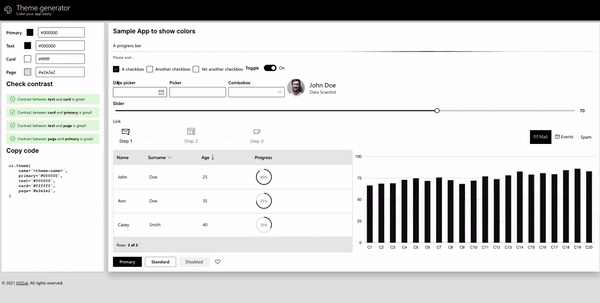
Theme generator
Wave comes with a simple Theme generator app that allows you to pick colors and see how they work together instantly.
This Wave app provides:
- Immediate visual feedback.
- Color contrast warnings when a particular contrast ratio is less than 4.5.
- Quick theme copy-pasting.
We would love to see all the beautiful themes our community came up with so don't hesitate and post the screenshots into our show and tell Github Discussions section! The best ones might even be included as predefined themes within Wave itself in the future.
Can individual colors be changed?
In general, the answer is no. Wave tries to be smart and do all the minor decisions for you, e.g. picking a color for primary/secondary buttons, checkboxes, etc. This way, a consistent UX is ensured and you can focus solely on the product itself rather than wasting time on nitpicking small stuff.
If full control over colors/typography etc. is needed, going with regular HTML/CSS/JS is probably a better choice.
However, some cards allow changing colors of particular parts, for example, icons or plots, but this is more of an exception rather than a strict rule. You can find available colors in the section below.
Wave colors
In addition to arbitrary CSS colors, you can use the colors that Wave uses itself.
- Spectrum colors are the most colors common colors with a slightly edited saturation so that they match the current theme.
- Wave's most used colors (text, card and primary) and their variations with increasing transparency (tone).
| Spectrum colors | Text tones | Card tones | Primary color tones |
|---|---|---|---|
| $amber | $text | $card | $primary |
| $azure | $text0 | $card0 | $primary0 |
| $blue | $text1 | $card1 | $primary1 |
| $brown | $text2 | $card2 | $primary2 |
| $cyan | $text3 | $card3 | $primary3 |
| $gray | $text4 | $card4 | $primary4 |
| $green | $text5 | $card5 | $primary5 |
| $indigo | $text6 | $card6 | $primary6 |
| $lime | $text7 | $card7 | $primary7 |
| $mint | $text8 | $card8 | $primary8 |
| $orange | $text9 | $card9 | $primary9 |
| $page | |||
| $pink | |||
| $purple | |||
| $red | |||
| $tangerine | |||
| $teal | |||
| $violet | |||
| $yellow |
All the above colors are just CSS variables with a $ prefix replaced with wave- which means they can be also used within your custom CSS. E.g. red color would be --wave-red.