Layout
This section illustrates how to lay out cards on a page.
Wave supports two layout systems out of the box: a grid layout and a flex (flexible) layout.
By default, pages use the grid-based system. The grid-based system is simpler to use and ensures that your page layout looks exactly the same on every display, without surprises.
To switch to a flex layout, simply define a page layout using the ui.layout() API, as shown below.
Flex Layout
The flex layout system allows you to build user interfaces and dashboards that adapt to various device and screen sizes ("responsive layout").
To view examples of flex and responsive layouts in actions, see https://github.com/h2oai/wave/tree/main/py/demo
To define a layout for your page, attach a layout to your page's meta card using ui.layout().
The following example defines a simple layout consisting of a header, a body and a footer. The body, in turn, is split horizontally into a content area and a sidebar.
q.page['meta'] = ui.meta_card(box='', layouts=[
    ui.layout(
        breakpoint='xl',
        width='1200px',
        zones=[
            ui.zone('header'),
            ui.zone('body', direction=ui.ZoneDirection.ROW, zones=[
                ui.zone('content', size='75%'),
                ui.zone('sidebar', size='25%'),
            ]),
            ui.zone('footer'),
        ]
    )
])
A layout, at a minimum, consists of a breakpoint and a set of zones.
Breakpoints
The breakpoint is the minimum viewport (browser) width at which the layout will be applied to the page. Values must be pixel widths (e.g. 0px, 576px, 768px) or a named preset. The named presets are:
xs:0pxfor extra small devices (portrait phones)s:576pxfor small devices (landscape phones)m:768pxfor medium devices (tablets)l:992pxfor large devices (desktops)xl:1200pxfor extra large devices (large desktops).
A breakpoint value of xs matches all viewport widths, unless other breakpoints are set.
Zones
A zone is a named area inside the layout where cards can be placed. A zone is defined using ui.zone().
Zones have a direction, either ui.ZoneDirection.COLUMN (with children laid out top to bottom) or ui.ZoneDirection.ROW (with children laid out left to right).
Zone can define a size, which translates to the zone's width in case the zone is laid out horizontally, or the zone's height in case the zone is laid out vertically.
Zones can have other zones nested inside them.
In the above example, the content and sidebar zones are laid out horizontally inside the body, with the content zone taking up 75% of the available width, and the sidebar taking up 25%.
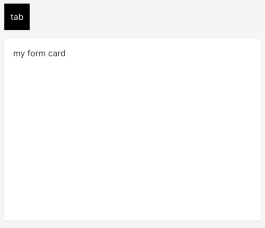
Cards will take up an equal amount of space inside the zone, not shrinking to fit their content. To prevent a card from expanding provide a ui.box with size='0'.
q.page['meta'] = ui.meta_card(box='', layouts=[
ui.layout(
breakpoint='xs',
zones=[ui.zone(name='zone1', direction=ui.ZoneDirection.COLUMN, size='100%')]
)
])
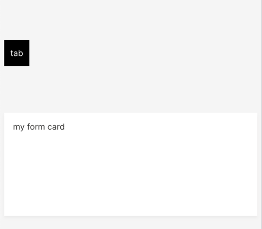
q.page['tab_card'] = ui.tab_card(
box=ui.box(zone='zone1'),
items=[ui.tab(name='tab1', label='tab')]
)
q.page['form_card'] = ui.form_card(box='zone1', items=[
ui.text(content='my form card')
])
Default behavior:
Using size='0':
q.page['tab_card'] = ui.tab_card(
    box=ui.box(zone='zone1', size='0'),
    items=[ui.tab(name='tab1', label='tab')]
)
Width and Height
By default, we encourage static units like px or rem for setting widths and heights (see MDN for more info). In flex layouts, percent values such as 100% only work if every ancestor has an explicit size, otherwise, the computed height can be zero and the content may not render as expected.
Responsive Layout
To make your page adapt to multiple viewport sizes, define multiple layouts using ui.layout().
q.page['meta'] = ui.meta_card(box='', layouts=[
    ui.layout(
        breakpoint='xs',
        zones=[
            # Add zones here.
        ],
    ),
    ui.layout(
        breakpoint='m',
        zones=[
            # Add zones here.
        ],
    ),
    ui.layout(
        breakpoint='xl',
        width='1200px',
        zones=[
            # Add zones here.
        ]
    )
])
Placing cards
To place a card inside a zone in your layout, use the card's box attribute.
The simplest way to assign a card to a zone is to set the box to the name of zone:
q.page['shopping_cart'] = ui.markdown_card(box='sidebar', ...)
For more control over how the card is placed, use ui.box():
# Same as box='sidebar'
q.page['shopping_cart'] = ui.markdown_card(box=ui.box('sidebar'), ...)
Make the card the third item in the sidebar:
q.page['shopping_cart'] = ui.markdown_card(box=ui.box('sidebar', order=3), ...)
Make the card take up two parts of available space:
q.page['shopping_cart'] = ui.markdown_card(box=ui.box('sidebar', size=2), ...)
Make cards take up available space in a 10:5:4 ratio:
q.page['shopping_cart'] = ui.markdown_card(box=ui.box('sidebar', order=1, size=10), ...)
q.page['bill'] = ui.markdown_card(box=ui.box('sidebar', order=2, size=5), ...)
q.page['discounts'] = ui.markdown_card(box=ui.box('sidebar', order=3, size=4), ...)
Make the card 200px wide:
q.page['shopping_cart'] = ui.markdown_card(box=ui.box('sidebar', width='200px'), ...)
Make the card 300px high:
q.page['shopping_cart'] = ui.markdown_card(box=ui.box('sidebar', height='300px'), ...)
Make the card 200px wide and 300px high:
q.page['shopping_cart'] = ui.markdown_card(box=ui.box('sidebar', width='200px', height='300px'), ...)
For responsive layouts, specify multiple boxes using ui.boxes(). Each ui.box() in ui.boxes() refers to the corresponding ui.layout() specified at the page level.
q.page['meta'] = ui.meta_card(box='', layouts=[
    ui.layout(breakpoint='xs', zones=[...]),
    ui.layout(breakpoint='m', zones=[...]),
    ui.layout(breakpoint='xl', zones=[...]),
])
q.page['shopping_cart'] = ui.markdown_card(box=ui.boxes(
    ui.box('bottom', height='300px'), # for breakpoint xs, place in the bottom zone.
    ui.box('middle', height='200px'), # for breakpoint m, place in the middle zone.
    ui.box('sidebar', height='2'), # for breakpoint xl, place in the sidebar zone.
), ... )
Aligning cards
Wave cards take all available space by default to avoid unnecessary whitespace. If the extra whitespace is desirable though, one may need to use align and justify zone attributes.
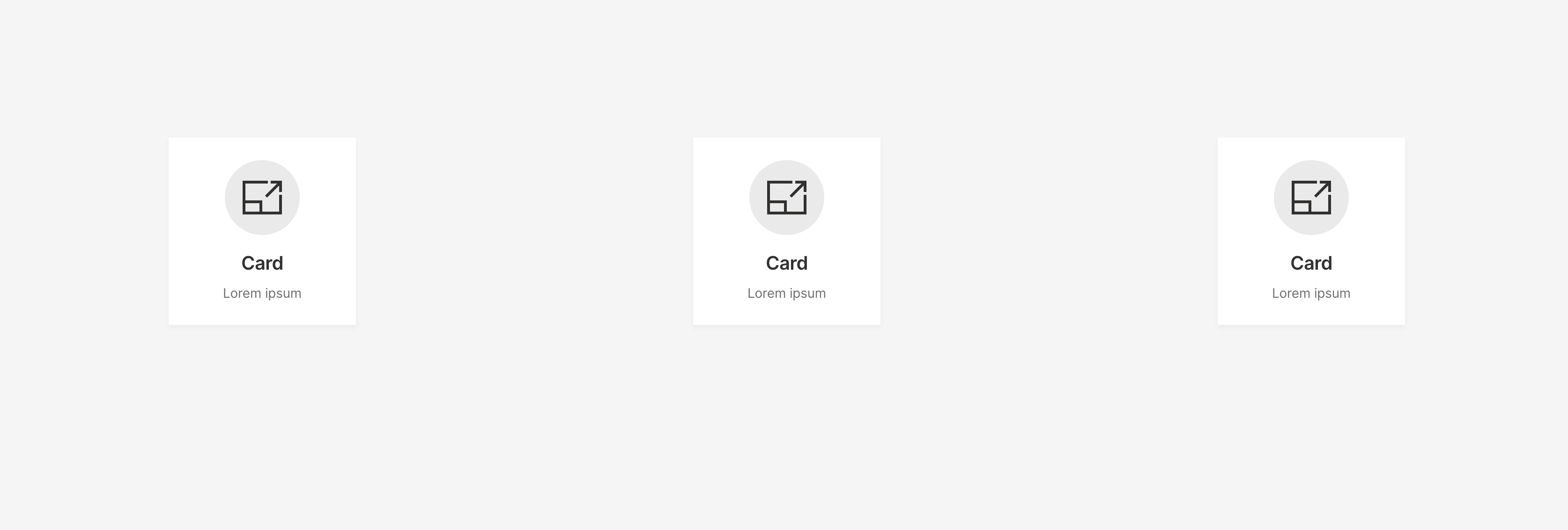
q.page['meta'] = ui.meta_card(box='', layouts=[ui.layout(breakpoint='xs', zones=[
    ui.zone(
        name='content',
        direction=ui.ZoneDirection.ROW,
        # Specify a zone size, otherwise will be adapted to the biggest card in the zone.
        size='500px',
        # Align cards on the cross-axis (vertical direction for ROW and horizontal for COLUMN).
        align='center',
        # Align cards on the main-axis (vertical direction for COLUMN and horizontal for ROW).
        justify='around'
    )
])])
q.page['card1'] = ui.tall_info_card(box=ui.box('content', width='200px', height='200px'), name='',
                                    title='Card', caption='Lorem ipsum')
q.page['card2'] = ui.tall_info_card(box=ui.box('content', width='200px', height='200px'), name='',
                                    title='Card', caption='Lorem ipsum')
q.page['card3'] = ui.tall_info_card(box=ui.box('content', width='200px', height='200px'), name='',
                                    title='Card', caption='Lorem ipsum')
To see the full alignment effect it's important to note that card sizes have to either be explicitly set (like in the example code) or the size attribute has to be set to '0' (since it defaults to '1').
Grid Layout
By default, every page has a grid system in place, designed to fit HD displays (1920 x 1080 pixels). The grid has 12 columns and 10 rows. A column is 134 pixels wide. A row is 76 pixels high. The gap between rows and columns is set to 15 pixels.
Placing cards
Every card has a box attribute that specifies how to position the card on the page, a string of the form 'column row width height', for example '1 1 2 4' or '8 7 3 6'.
page['quote'] = ui.markdown_card(
    box='1 1 2 2',
    title='Hello World',
    content='"The Internet? Is that thing still around?" - *Homer Simpson*',
)
The column and row indicate which column and row to position the top-left corner of the card. The width and height indicate the width and height of the cards, respectively. The column and row are 1-based. The width and height are in spans (units) of columns or rows.
| Attribute | Value | Interpreted as |
|---|---|---|
| column | N | Nth column |
| row | N | Nth row |
| width | N | N columns wide |
| height | N | N rows high |
For example, a box of 1 2 3 4 is interpreted as:
| Attribute | Value | Interpreted as |
|---|---|---|
| column | 1 | 1st column |
| row | 2 | 2nd row |
| width | 3 | 3 columns wide |
| height | 4 | 4 rows high |
The default grid is designed to fit HD displays (1920 x 1080 pixels), so if you want your page to fit smaller displays, don't use up the entire grid. Instead, use up less columns and rows, like 8 columns x 6 rows.
See also
layout.py and layout-size.py in Tour app.