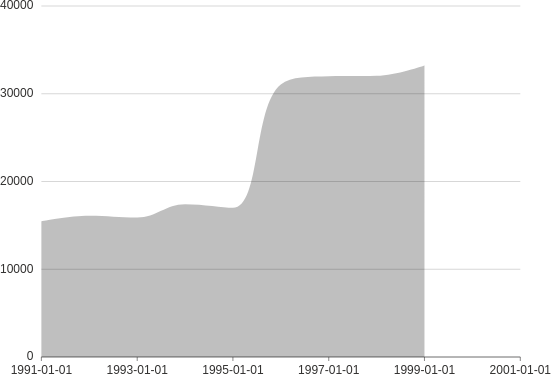
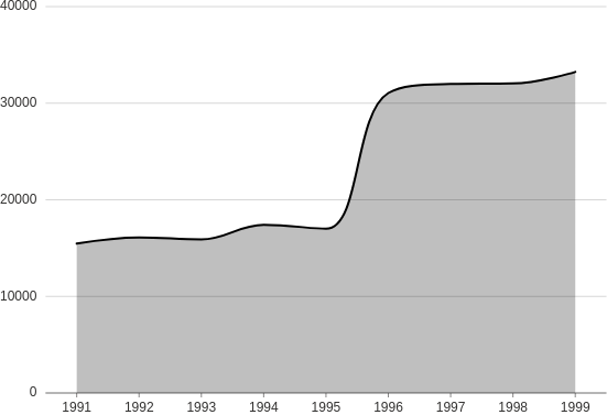
Area
Use area charts if the total value is as important as individual values and you want to show the relationship between these two. However, area charts work well only if the value differences are larger otherwise you end up with a single big area covering most of the chart.
Check the full API at ui.plot_card.
from h2o_wave import data
q.page['example'] = ui.plot_card(
box='1 1 5 5',
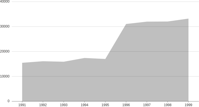
title='Area',
data=data('year price', 9, rows=[
('1991', 15468),
('1992', 16100),
('1993', 15900),
('1994', 17409),
('1995', 17000),
('1996', 31056),
('1997', 31982),
('1998', 32040),
('1999', 33233),
]),
plot=ui.plot([ui.mark(type='area', x='=year', y='=price', y_min=0)])
)
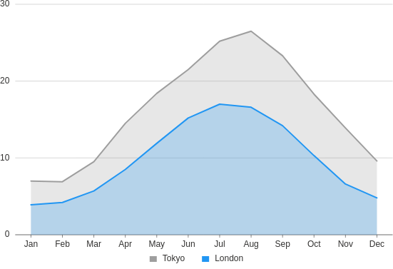
Groups
Make an area plot showing multiple categories.
from h2o_wave import data
q.page['example'] = ui.plot_card(
box='1 1 4 5',
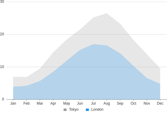
title='Area, groups',
data=data('month city temperature', 24, rows=[
('Jan', 'Tokyo', 7),
('Jan', 'London', 3.9),
('Feb', 'Tokyo', 6.9),
('Feb', 'London', 4.2),
('Mar', 'Tokyo', 9.5),
('Mar', 'London', 5.7),
('Apr', 'Tokyo', 14.5),
('Apr', 'London', 8.5),
('May', 'Tokyo', 18.4),
('May', 'London', 11.9),
('Jun', 'Tokyo', 21.5),
('Jun', 'London', 15.2),
('Jul', 'Tokyo', 25.2),
('Jul', 'London', 17),
('Aug', 'Tokyo', 26.5),
('Aug', 'London', 16.6),
('Sep', 'Tokyo', 23.3),
('Sep', 'London', 14.2),
('Oct', 'Tokyo', 18.3),
('Oct', 'London', 10.3),
('Nov', 'Tokyo', 13.9),
('Nov', 'London', 6.6),
('Dec', 'Tokyo', 9.6),
('Dec', 'London', 4.8),
]),
plot=ui.plot([
ui.mark(type='area', x='=month', y='=temperature', color='=city', y_min=0)
])
)
Stacked
Make a stacked area plot.
from h2o_wave import data
q.page['example'] = ui.plot_card(
box='1 1 4 5',
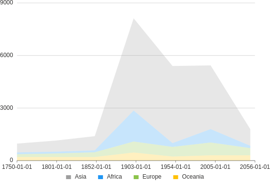
title='Area, stacked',
data=data('country year value', 28, rows=[
('Asia', '1750', 502),
('Asia', '1800', 635),
('Asia', '1850', 809),
('Asia', '1900', 5268),
('Asia', '1950', 4400),
('Asia', '1999', 3634),
('Asia', '2050', 947),
('Africa', '1750', 106),
('Africa', '1800', 107),
('Africa', '1850', 111),
('Africa', '1900', 1766),
('Africa', '1950', 221),
('Africa', '1999', 767),
('Africa', '2050', 133),
('Europe', '1750', 163),
('Europe', '1800', 203),
('Europe', '1850', 276),
('Europe', '1900', 628),
('Europe', '1950', 547),
('Europe', '1999', 729),
('Europe', '2050', 408),
('Oceania', '1750', 200),
('Oceania', '1800', 200),
('Oceania', '1850', 200),
('Oceania', '1900', 460),
('Oceania', '1950', 230),
('Oceania', '1999', 300),
('Oceania', '2050', 300),
]),
plot=ui.plot([
ui.mark(type='area', x_scale='time', x='=year', y='=value', y_min=0, color='=country', stack='auto')
])
)
Range
Make an area plot representing a range (band) of values.
from h2o_wave import data
q.page['example'] = ui.plot_card(
box='1 1 4 5',
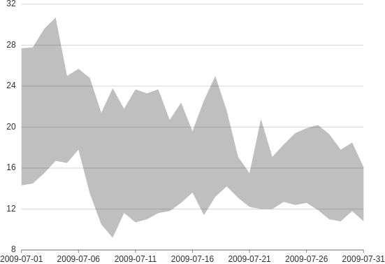
title='Area, range',
data=data('date low high', 31, rows=[
(1246406400000, 14.3, 27.7),
(1246492800000, 14.5, 27.8),
(1246579200000, 15.5, 29.6),
(1246665600000, 16.7, 30.7),
(1246752000000, 16.5, 25.0),
(1246838400000, 17.8, 25.7),
(1246924800000, 13.5, 24.8),
(1247011200000, 10.5, 21.4),
(1247097600000, 9.2, 23.8),
(1247184000000, 11.6, 21.8),
(1247270400000, 10.7, 23.7),
(1247356800000, 11.0, 23.3),
(1247443200000, 11.6, 23.7),
(1247529600000, 11.8, 20.7),
(1247616000000, 12.6, 22.4),
(1247702400000, 13.6, 19.6),
(1247788800000, 11.4, 22.6),
(1247875200000, 13.2, 25.0),
(1247961600000, 14.2, 21.6),
(1248048000000, 13.1, 17.1),
(1248134400000, 12.2, 15.5),
(1248220800000, 12.0, 20.8),
(1248307200000, 12.0, 17.1),
(1248393600000, 12.7, 18.3),
(1248480000000, 12.4, 19.4),
(1248566400000, 12.6, 19.9),
(1248652800000, 11.9, 20.2),
(1248739200000, 11.0, 19.3),
(1248825600000, 10.8, 17.8),
(1248912000000, 11.8, 18.5),
(1248998400000, 10.8, 16.1),
]),
plot=ui.plot([ui.mark(type='area', x_scale='time', x='=date', y0='=low', y='=high')])
)
Negative
Make an area plot showing positive and negative values.
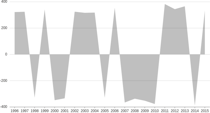
from h2o_wave import data

q.page['example'] = ui.plot_card(
    box='1 1 5 5',
    title='Area, negative values',
    data=data('year value', 20, rows=[
        ('1996', 322),
        ('1997', 324),
        ('1998', -329),
        ('1999', 342),
        ('2000', -348),
        ('2001', -334),
        ('2002', 325),
        ('2003', 316),
        ('2004', 318),
        ('2005', -330),
        ('2006', 355),
        ('2007', -366),
        ('2008', -337),
        ('2009', -352),
        ('2010', -377),
        ('2011', 383),
        ('2012', 344),
        ('2013', 366),
        ('2014', -389),
        ('2015', 334),
    ]),
    plot=ui.plot([ui.mark(type='area', x='=year', y='=value')])
)
Smooth
Make an area plot with a smooth curve.
from h2o_wave import data

q.page['example'] = ui.plot_card(
    box='1 1 4 5',
    title='Area, smooth',
    data=data('year price', 9, rows=[
        ('1991', 15468),
        ('1992', 16100),
        ('1993', 15900),
        ('1994', 17409),
        ('1995', 17000),
        ('1996', 31056),
        ('1997', 31982),
        ('1998', 32040),
        ('1999', 33233),
    ]),
    plot=ui.plot([ui.mark(type='area', x_scale='time', x='=year', y='=price', curve='smooth', y_min=0)])
)
Line
Make an area plot with an additional line layer on top.
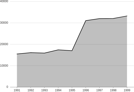
from h2o_wave import data

q.page['example'] = ui.plot_card(
    box='1 1 4 5',
    title='Area + Line',
    data=data('year price', 9, rows=[
        ('1991', 15468),
        ('1992', 16100),
        ('1993', 15900),
        ('1994', 17409),
        ('1995', 17000),
        ('1996', 31056),
        ('1997', 31982),
        ('1998', 32040),
        ('1999', 33233),
    ]),
    plot=ui.plot([
        ui.mark(type='area', x='=year', y='=price', y_min=0),
        ui.mark(type='line', x='=year', y='=price')
    ])
)
Line groups
Make a combined area + line plot showing multiple categories.
from h2o_wave import data

q.page['example'] = ui.plot_card(
    box='1 1 4 5',
    title='Area + Line, groups',
    data=data('month city temperature', 24, rows=[
        ('Jan', 'Tokyo', 7),
        ('Jan', 'London', 3.9),
        ('Feb', 'Tokyo', 6.9),
        ('Feb', 'London', 4.2),
        ('Mar', 'Tokyo', 9.5),
        ('Mar', 'London', 5.7),
        ('Apr', 'Tokyo', 14.5),
        ('Apr', 'London', 8.5),
        ('May', 'Tokyo', 18.4),
        ('May', 'London', 11.9),
        ('Jun', 'Tokyo', 21.5),
        ('Jun', 'London', 15.2),
        ('Jul', 'Tokyo', 25.2),
        ('Jul', 'London', 17),
        ('Aug', 'Tokyo', 26.5),
        ('Aug', 'London', 16.6),
        ('Sep', 'Tokyo', 23.3),
        ('Sep', 'London', 14.2),
        ('Oct', 'Tokyo', 18.3),
        ('Oct', 'London', 10.3),
        ('Nov', 'Tokyo', 13.9),
        ('Nov', 'London', 6.6),
        ('Dec', 'Tokyo', 9.6),
        ('Dec', 'London', 4.8),
    ]),
    plot=ui.plot([
        ui.mark(type='area', x='=month', y='=temperature', color='=city', y_min=0),
        ui.mark(type='line', x='=month', y='=temperature', color='=city')
    ])
)
Line smooth
Make a combined area + line plot using a smooth curve.
from h2o_wave import data

q.page['example'] = ui.plot_card(
    box='1 1 4 5',
    title='Area + Line, smooth',
    data=data('year price', 9, rows=[
        ('1991', 15468),
        ('1992', 16100),
        ('1993', 15900),
        ('1994', 17409),
        ('1995', 17000),
        ('1996', 31056),
        ('1997', 31982),
        ('1998', 32040),
        ('1999', 33233),
    ]),
    plot=ui.plot([
        ui.mark(type='area', x='=year', y='=price', curve='smooth', y_min=0),
        ui.mark(type='line', x='=year', y='=price', curve='smooth')
    ])
)