Color Picker
Use this component when you wish to collect color values.
The name attribute indicates how to reference this component in the query arguments: q.args.<name-attr>.
You can see the API for ui.color_picker or check the interactive example in Tour app.
Basic Color picker
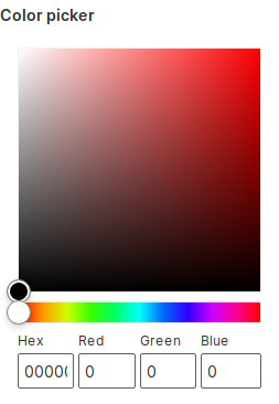
q.page['example'] = ui.form_card(box='1 1 2 5', items=[
    ui.color_picker(name='color_picker', label='Color picker')
])
Setting initial values
Use the value attribute to control the preselected state of the color picker.
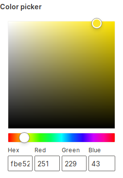
q.page['example'] = ui.form_card(box='1 1 2 5', items=[
    ui.color_picker(name='color_picker', label='Color picker', value='#FBE52B')
])
Inline
Color picker as is can take a lot of space. For cases where space is limited, use the inline attribute that displays a more compact version.
q.page['example'] = ui.form_card(box='1 1 5 2', items=[
    ui.color_picker(name='color_picker', label='Color picker', inline=True)
])
Swatch
If the choices parameter is set, a swatch picker is displayed instead of the standard color picker.
This allows you to constrain the colors the user can pick.

q.page['example'] = ui.form_card(box='1 1 3 2', items=[
    ui.color_picker(name='swatch_picker', label='Swatch picker', choices=[
        '#011627', '#2EC4B6', '#E71D36', '#FF9F1C', '#50514F',
        '#F25F5C', '#FFE066', '#247BA0', '#70C1B3', '#FDFFFC'
    ])
])