Inline
By default, all form items are laid out vertically (top to bottom). For more complex forms though, this might not be enough and
that's where ui.inline comes into play. All you need to do is specify the items attribute, which accepts any form
component.

q.page['form'] = ui.form_card(
    box='1 1 4 2',
    items=[ui.inline(items=[
        ui.textbox(name='textbox1', label='Textbox 1'),
        ui.textbox(name='textbox2', label='Textbox 2'),
        ui.textbox(name='textbox3', label='Textbox 3'),
    ])],
)
All components will try to take all the available space by default. This behavior can be controlled by specifying width and height component properties explicitly.
Check the full API at ui.inline.
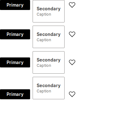
Horizontal alignment (justify)
You can specify how the elements should be horizontally aligned using the justify parameter. The default value is start.
items = [
    ui.button(name='primary_button', label='Primary', primary=True),
    ui.button(name='basic_caption_button', label='Secondary', caption='Caption'),
    ui.button(name='icon_button', icon='Heart', caption='Like'),
]

q.page['justify'] = ui.form_card(box='1 1 3 5', items=[
    ui.inline(items, justify='start'),
    ui.inline(items, justify='center'),
    ui.inline(items, justify='end'),
    ui.inline(items, justify='between'),
    ui.inline(items, justify='around'),
])
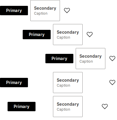
Vertical alignment (align)
You can specify how the elements should be horizontally aligned using the align parameter. The default value is center.
items = [
    ui.button(name='primary_button', label='Primary', primary=True),
    ui.button(name='basic_caption_button', label='Secondary', caption='Caption'),
    ui.button(name='icon_button', icon='Heart', caption='Like'),
]

q.page['align'] = ui.form_card(box='1 1 3 5', items=[
    ui.inline(items, align='start'),
    ui.inline(items, align='baseline'),
    ui.inline(items, align='center'),
    ui.inline(items, align='end'),
])
Setting height
Height of the ui.inline can be controlled via the height attribute, supporting all valid CSS units. However, % may not always work as you might expect so it's advised to use static units like px, rem etc.
It's also possible to specify 1 to fill the remaining card space. Useful for displaying form items in the middle of the card or just making more breathing room.

q.page['example'] = ui.form_card(box='1 1 -1 -1', items=[
    ui.inline(
        items=[ui.text('I am in the perfect center!')],
        justify='center',
        align='center',
        height='1'
    )
])
Direction
The inline component allows for laying out the components in 2 directions, row (default) and column. This might be useful if multiple sections (consisting of more than 1 component) need to be placed next to each other. In such case, ui.inline serves as a container grouping multiple components into a single section.

q.page['example'] = ui.form_card(box='1 1 -1 3', items=[
    ui.text_xl('Header'),
    ui.inline(
        height='1',
        justify='around',
        align='center',
        items=[
            ui.inline(
                direction='column',
                align='center',
                items=[
                    ui.text_l(content='Sub title 1'),
                    ui.text(content='Lorem ipsum dolor sit amet'),
                ]
            ),
            ui.inline(
                direction='column',
                align='center',
                items=[
                    ui.text_l(content='Sub title 2'),
                    ui.text(content='Lorem ipsum dolor sit amet'),
                ]
            ),
            ui.inline(
                direction='column',
                align='center',
                items=[
                    ui.text_l(content='Sub title 3'),
                    ui.text(content='Lorem ipsum dolor sit amet'),
                ]
            ),
        ]
    ),
    ui.text('Footer'),
])