Table
This table differs from a markdown table in that it supports clicking or selecting rows, provides built-in search, sort, filter and group by. If you simply want to display a non-interactive table of information, use a markdown table.
The name attribute indicates how to reference this component in the query arguments: q.args.<name-attr>.
You can see the API for ui.table or check the interactive example in Tour app.
Basic table

q.page['example'] = ui.form_card(box='1 1 3 3', items=[
    ui.table(
        name='table',
        columns=[
            ui.table_column(name='name', label='Name'),
            ui.table_column(name='surname', label='Surname'),
        ],
        rows=[
            ui.table_row(name='row1', cells=['John', 'Doe']),
            ui.table_row(name='row2', cells=['Alice', 'Smith']),
            ui.table_row(name='row3', cells=['Bob', 'Adams']),
        ]
    )
])
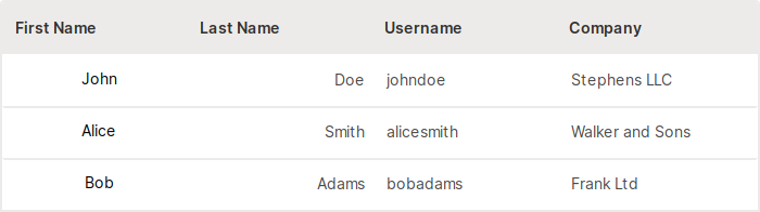
With column alignment
With this option, you can align the values of a particular column to left, right or center. This is optional and the default alignment is set to left.
q.page['example'] = ui.form_card(box='1 1 5 3', items=[
    ui.table(
        name='table',
        columns=[
            ui.table_column(name='first_name', label='First Name', align='center'),
            ui.table_column(name='last_name', label='Last Name', align='right'),
            ui.table_column(name='username', label='Username', align='left'),
            ui.table_column(name='company', label='Company'),
        ],
        rows=[
            ui.table_row(name='row1', cells=['John', 'Doe', 'johndoe', 'Stephens LLC']),
            ui.table_row(name='row2', cells=['Alice', 'Smith', 'alicesmith', 'Walker and Sons']),
            ui.table_row(name='row3', cells=['Bob', 'Adams', 'bobadams', 'Frank Ltd']),
        ]
    )
])
With selection
By default, each row in the table is clickable. When a cell in the column with link=True
(defaults to first column) is clicked, the form is submitted automatically and q.args.table_name is set to [row_name],
where table_name is the name attribute of the table, and row_name is the name attribute of the row that was clicked.
Double-clicking the row results in submission as well.
If multiple or single selection is activated (multiple or single is set to True), doubleclicking is turned off.
In addition, each row in the table gets its own checkmark indicating current selection state which can be obtained either by providing a separate submission button (populated in q.args) or by registering a 'select' event (populated in q.events).
With multiple selection
If multiple is set to True, multiple rows can be selected either by clicking on the checkmarks, shift+clicking or ctrl+clicking anywhere on the row or using marquee selection.

q.page['example'] = ui.form_card(box='1 1 3 4', items=[
    ui.table(name='table', multiple=True, columns=[
        ui.table_column(name='name', label='Name'),
        ui.table_column(name='surname', label='Surname'),
    ], rows=[
        ui.table_row(name='row1', cells=['John', 'Doe']),
        ui.table_row(name='row2', cells=['Alice', 'Smith']),
        ui.table_row(name='row3', cells=['Bob', 'Adams']),
    ])
])
When the form is submitted, q.args.<table_name> is set to [<row1_name>, <row2_name>, ...] where table_name is the
name of the table, and row1_name, row2_name are the name of the rows that were selected.
With single selection
When single is set to True only one row at time can be selected.
q.page['example'] = ui.form_card(box='1 1 3 4', items=[
    ui.table(name='table', single=True, columns=[
        ui.table_column(name='name', label='Name'),
        ui.table_column(name='surname', label='Surname'),
    ], rows=[
        ui.table_row(name='row1', cells=['John', 'Doe']),
        ui.table_row(name='row2', cells=['Alice', 'Smith']),
        ui.table_row(name='row3', cells=['Bob', 'Adams']),
    ])
])
When the form is submitted, q.args.<table_name> is set to [<row_name>] where table_name is the
name of the table, and row_name is the name of the row that was selected.
Checkbox visibility
When multiple or single is specified, there is an option to control when should row checkboxes be visible.
By default, they are only visible on hover. Available options are always, on-hover, hidden.

q.page['example'] = ui.form_card(box='1 1 3 4', items=[
    ui.table(name='table', checkbox_visibility='always',
        multiple=True, columns=[
        ui.table_column(name='name', label='Name'),
        ui.table_column(name='surname', label='Surname'),
    ], rows=[
        ui.table_row(name='row1', cells=['John', 'Doe']),
        ui.table_row(name='row2', cells=['Alice', 'Smith']),
        ui.table_row(name='row3', cells=['Bob', 'Adams']),
    ])
])
Select event
Sometimes it can be useful to update other components immediately based on the current row selection (e.g. enable/disable the submit button).
This is where the select event comes into the game. When the select event is registered, it is emitted every time when there is a change
in the current table row selection. It can be accessed through q.events.<table_name>.select and contains the list of all selected item names, where table_name
is the name attribute of the table.

q.page['example'] = ui.form_card(box='1 1 3 4', items=[
    ui.table(
        name='table',
        columns=[ui.table_column(name='text', label='Table select event')],
        rows=[
            ui.table_row(name='row1', cells=['Row 1']),
            ui.table_row(name='row2', cells=['Row 2']),
            ui.table_row(name='row3', cells=['Row 3'])
        ],
        multiple=True,
        events=['select']
    )
])
With preselection
If you want to have one or multiple rows preselected, use either value or values attribute.
When values attribute is set, multiple selections will be allowed (multiple=True implicitly).

q.page['example'] = ui.form_card(box='1 1 3 4', items=[
    ui.table(name='table', values=['row1', 'row3'], columns=[
        ui.table_column(name='name', label='Name'),
        ui.table_column(name='surname', label='Surname'),
    ], rows=[
        ui.table_row(name='row1', cells=['John', 'Doe']),
        ui.table_row(name='row2', cells=['Alice', 'Smith']),
        ui.table_row(name='row3', cells=['Bob', 'Adams']),
    ])
])
When specifying the value attribute, only one row can be preselected and single selections will be allowed (single=True implicitly).

q.page['example'] = ui.form_card(box='1 1 3 4', items=[
    ui.table(name='table', columns=[
        ui.table_column(name='name', label='Name'),
        ui.table_column(name='surname', label='Surname'),
    ], rows=[
        ui.table_row(name='row1', cells=['John', 'Doe']),
        ui.table_row(name='row2', cells=['Alice', 'Smith']),
        ui.table_row(name='row3', cells=['Bob', 'Adams']),
    ], value='row2')
])
With search
As stated above, the table provides a built-in search also. Activation consists of specifying any
column as searchable. This way one can control which columns should affect searched results.

q.page['example'] = ui.form_card(box='1 1 3 4', items=[
    ui.table(name='table', columns=[
        ui.table_column(name='name', label='Name', searchable=True),
        ui.table_column(name='surname', label='Surname'),
    ], rows=[
        ui.table_row(name='row1', cells=['John', 'Doe']),
        ui.table_row(name='row2', cells=['Alice', 'Smith']),
        ui.table_row(name='row3', cells=['Bob', 'Adams']),
    ])
])
With filter
Similar to search if you want to take advantage of a built-in filter, just specify a column as
filterable. This will render a small chevron next to a column name which expands after clicking, giving
you the option to check any of the unique column values and filter the table. We advise using filtering
only on columns that consist of a limited set of values, e.g. statuses like RUNNING, PENDING. If
you specified it on a column with any arbitrary text column, there would be too many filtering
checkboxes which would be hard to navigate for your users.

q.page['example'] = ui.form_card(box='1 1 3 4', items=[
    ui.table(name='table', columns=[
        ui.table_column(name='name', label='Name'),
        ui.table_column(name='status', label='Status', filterable=True),
    ], rows=[
        ui.table_row(name='row1', cells=['John', 'Employed']),
        ui.table_row(name='row2', cells=['Alice', 'Unemployed']),
        ui.table_row(name='row3', cells=['Bob', 'Employed']),
    ])
])
With group by
Another cool feature of the Wave table is group by. All it takes is to specify a groupable option
on the table and a dropdown will render with columns on which a user can group by data.

q.page['example'] = ui.form_card(box='1 1 3 4', items=[
    ui.table(name='table', groupable=True, columns=[
        ui.table_column(name='name', label='Name'),
        ui.table_column(name='surname', label='Surname'),
    ], rows=[
        ui.table_row(name='row1', cells=['John', 'Doe']),
        ui.table_row(name='row2', cells=['Alice', 'Smith']),
        ui.table_row(name='row3', cells=['Bob', 'Adams']),
    ])
])
With download
Want to allow your users to download the data you just showed them via table? No problem! Simply
specify downloadable prop.

q.page['example'] = ui.form_card(box='1 1 3 3', items=[
    ui.table(name='table', downloadable=True, columns=[
        ui.table_column(name='name', label='Name'),
        ui.table_column(name='surname', label='Surname'),
    ], rows=[
        ui.table_row(name='row1', cells=['John', 'Doe']),
        ui.table_row(name='row2', cells=['Alice', 'Smith']),
        ui.table_row(name='row3', cells=['Bob', 'Adams']),
    ])
])
With reset
If you take advantage of all these built-in features, it might be a good idea to provide your users with an
escape hatch when they search/filter/group by too much and would like to get back to original view
with ease. That's exactly what resettable is for.

q.page['example'] = ui.form_card(box='1 1 3 3', items=[
    ui.table(name='table', resettable=True, columns=[
        ui.table_column(name='name', label='Name'),
        ui.table_column(name='surname', label='Surname'),
    ], rows=[
        ui.table_row(name='row1', cells=['John', 'Doe']),
        ui.table_row(name='row2', cells=['Alice', 'Smith']),
        ui.table_row(name='row3', cells=['Bob', 'Adams']),
    ])
])
Setting width and height
By default, the table tries to fit all horizontal available space and use as much vertical space as
needed. For tables with > 10 rows, the initial height is 500px.
In some cases though, it might be desirable to control the dimensions yourself via width and height
attributes. Both accept CSS units,
however % values for height might not work as you think (especially in flex layout)
so we discourage its use in favor of more static units like px or rem.

q.page['example'] = ui.form_card(box='1 1 3 3', items=[
    ui.table(name='table', width='200px', height='200px', columns=[
        ui.table_column(name='name', label='Name'),
        ui.table_column(name='surname', label='Surname'),
    ], rows=[
        ui.table_row(name='row1', cells=['John', 'Doe']),
        ui.table_row(name='row2', cells=['Alice', 'Smith']),
        ui.table_row(name='row3', cells=['Bob', 'Adams']),
    ])
])
To fill all of the remaining card height, set the height attribute to 1.

q.page['example'] = ui.form_card(box='1 1 3 3', items=[
    ui.table(name='table', height='1', columns=[
        ui.table_column(name='name', label='Name'),
        ui.table_column(name='surname', label='Surname'),
    ], rows=[
        ui.table_row(name='row1', cells=['John', 'Doe']),
        ui.table_row(name='row2', cells=['Alice', 'Smith']),
        ui.table_row(name='row3', cells=['Bob', 'Adams']),
    ])
])
With tags
Use tags to emphasize a specific value, usually an enum value like a certain state for example. For multiple tags in a single row use , as a delimiter.

q.page['example'] = ui.form_card(box='1 1 3 3', items=[
    ui.table(
        name='table',
        columns=[
            ui.table_column(name='text', label='Process'),
            ui.table_column(name='tag', label='Status',
                cell_type=ui.tag_table_cell_type(
                    name='tags',
                    tags=[
                        ui.tag(label='FAIL', color='$red'),
                        ui.tag(label='DONE', color='#D2E3F8', label_color='#053975'),
                        ui.tag(label='SUCCESS', color='$mint'),
                    ]
                ))
        ],
        rows=[
            ui.table_row(name='row1', cells=['Process1', 'FAIL']),
            ui.table_row(name='row2', cells=['Process2', 'SUCCESS,DONE']),
            ui.table_row(name='row3', cells=['Process3', 'DONE']),
        ])
])
With text-overflow
By default, text that does not fit into the table cell is signaled to users with ellipsis (...). However, you can change this with an overflow prop. Available options are:
'tooltip': shows the whole text in a tooltip when hovering over it'wrap': wraps the long text on multiple lines

q.page['example'] = ui.form_card(box='1 1 3 4', items=[
    ui.table(name='table', columns=[
        ui.table_column(name='name', label='Name'),
        ui.table_column(name='about', label='About', cell_overflow='wrap'),
    ], rows=[
        ui.table_row(
            name='row1',
            cells=['John', 'John is the former employee of the year.']
        ),
        ui.table_row(
            name='row2',
            cells=['Alice', 'Alice is an ambicious newcommer.']
        ),
        ui.table_row(
            name='row3',
            cells=['Bob', 'Bob is in our company for almost 35 years']
        ),
    ])
])
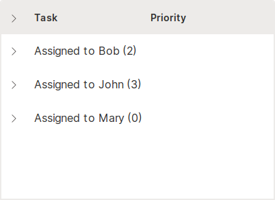
With groups
If groupable prop does not suit your needs, you can specify your custom groups with the groups attribute.
q.page['example'] = ui.form_card(box='1 1 3 4', items=[
    ui.table(
        name='table',
        columns=[
            ui.table_column(name='task', label='Task'),
            ui.table_column(name='priority', label='Priority')
        ],
        groups=[
            ui.table_group("Assigned to Bob", [
                ui.table_row(name='row1', cells=['Task1', 'Moderate']),
                ui.table_row(name='row2', cells=['Task2', 'High'])
            ]),
            ui.table_group("Assigned to John", [
                ui.table_row(name='row3', cells=['Task3', 'High']),
                ui.table_row(name='row4', cells=['Task4', 'Low']),
                ui.table_row(name='row5', cells=['Task5', 'Very High'])
            ]),
            ui.table_group("Assigned to Mary", []),
        ])
])
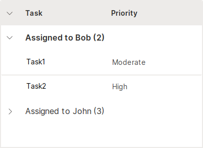
With collapsed groups
Groups are shown in a collapsed state by default. With the collapsed attribute you can change this behavior. You can also keep track of the collapsed states by registering a 'group_change' event (populated in q.events). This is useful when needing to refresh the table and persist collapsed states.
q.page['example'] = ui.form_card(box='1 1 3 4', items=[
    ui.table(
        name='table',
        columns=[
            ui.table_column(name='task', label='Task'),
            ui.table_column(name='priority', label='Priority')
        ],
        groups=[
            ui.table_group("Assigned to Bob", [
                ui.table_row(name='row1', cells=['Task1', 'Moderate']),
                ui.table_row(name='row2', cells=['Task2', 'High'])
            ], collapsed=False),
            ui.table_group("Assigned to John", [
                ui.table_row(name='row3', cells=['Task3', 'High']),
                ui.table_row(name='row4', cells=['Task4', 'Low']),
                ui.table_row(name='row5', cells=['Task5', 'Very High'])
            ])
        ],
        events=['group_change'])
])
With pagination
Paginated table differs from regular table in its ability to handle large amounts of data (100k+ rows). Instead of sending all the rows at once, pagination allows you to send just a specific chunk of data needed for the current page. The size of this chunk is defined as rows_per_page.

q.page['example'] = ui.form_card(box='1 1 3 6', items=[
    ui.table(
        name='table',
        columns=[ui.table_column(name='name', label='Name')],
        rows=[
            ui.table_row(name='row1', cells=['John']),
            ui.table_row(name='row2', cells=['Alice']),
            ui.table_row(name='row3', cells=['Bob']),
            ui.table_row(name='row4', cells=['John']),
            ui.table_row(name='row5', cells=['Alice']),
            ui.table_row(name='row6', cells=['Bob']),
            ui.table_row(name='row7', cells=['John']),
            ui.table_row(name='row8', cells=['Alice']),
            ui.table_row(name='row9', cells=['Bob']),
            ui.table_row(name='row10', cells=['John']),
        ],
        # Add pagination attribute to make your table paginated.
        pagination=ui.table_pagination(total_rows=20, rows_per_page=10),
        # Register events to listen, all of these have to be handled by developer.
        events=['page_change']
    )
])
Check the complete example with all the supported features like sort/filter/search/download/reset.
With actions
You can group multiple actions in a context menu for each row by setting cell_type to ui.menu_table_cell_type and providing the commands you want. Use q.args.<command_name> to identify which command was clicked. Since every cell in the actions column will have the same content (an icon that opens a menu) you can simply specify an empty string as a placeholder so that the cells are provided in the correct order.
See the example to learn how to handle the actions in a real-world scenario.

commands = [
    ui.command(name='details', label='Details', icon='Info'),
    ui.command(name='delete', label='Delete', icon='Delete'),
]

q.page['example'] = ui.form_card(box='1 1 3 3', items=[
    ui.table(
        name='table',
        columns=[ui.table_column(name='actions', label='Actions', cell_type=ui.menu_table_cell_type(name='commands', commands=commands))],
        rows=[ui.table_row(name='first_row', cells=[''])]
    )
])
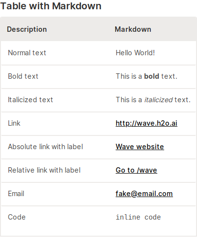
Markdown support
Leverage the power and versatility of Markdown by setting cell_type to markdown_cell_type.
To open links in a new tab use target='_blank'.
q.page['example'] = ui.form_card(box='1 1 3 6', items=[
    ui.text_xl(content='Table with Markdown'),
    ui.table(
        name='table',
        columns=[
            ui.table_column(name='description', label='Description', min_width='200',
                            cell_type=ui.markdown_table_cell_type(target='_blank')),
            ui.table_column(name='markdown', label='Markdown',
                            cell_type=ui.markdown_table_cell_type(target='_blank')),
        ],
        height='450px',
        rows=[
            ui.table_row(name='row1', cells=['Normal text', 'Hello World!']),
            ui.table_row(name='row2', cells=['Bold text', 'This is a **bold** text.']),
            ui.table_row(name='row3', cells=['Italicized text', 'This is a _italicized_ text.']),
            ui.table_row(name='row4', cells=['Link', '<http://wave.h2o.ai>']),
            ui.table_row(name='row5', cells=['Absolute link with label', '[Wave website](http://wave.h2o.ai/)']),
            ui.table_row(name='row6', cells=['Relative link with label', '[Go to /wave](/wave)']),
            ui.table_row(name='row7', cells=['Email', '<fake@email.com>']),
            ui.table_row(name='row8', cells=['Code', '``inline code``']),  # change to monospaced font
        ]
    )
])